I am making a baby album for a friend of mine. She is not a scrapbooker. There are a few things to consider when making an album for a non-scrapbooker. First remember that the picture comes first. I love tons of embellishments and different size photos. I like being artsy with my personal pages. But for a friends album that I am not sure of their artsy side, I try to keep it simple and not too busy. You also have to remember that they may not also be into photography or have a photo editing software. They probably just use a point and shoot camera, center their subject on the screen and push the button. They probably take horizontal pictures and sometimes when they feel wild, they will turn their camera side ways and get a vertical shot. Now that they have taken their pictures, they will take them to their local Walgreens, CVS or Walmart and print doubles in 4X6 and maybe a 5X7. Oh, and don't forget to ask if there is a theme to their baby room. In this case the theme was princess and the room is done in pastels with focus on pink and purple.
You have to take all this information into consideration when creating an album for this friend. You are limited on photo placement and size (4X6 and 5X7) and most of your photo placements should be horizontal. You also want it to make it as easy for them as possible. They will probably print out their pictures, take some office tape, role it up so that it becomes double sided and place the picture in the album. They will probably write the date in the journal spot. And that is fine. You want to make the album that easy for them. Remember, they are not a scrapbooker and any more than that and they will tuck it away and your album will never be seen again.
This album will consist of 26 12X12 pages. 24 of them will be displayed as a double layout and one will be the title page and one will be the back page. Because I have 26 pages to do and very limited time (the baby was born 10/13/2009..I am already late), I had to do much of designing on the go. (Thank you Gypsy). But I also had to use 3 or 4 basic templates. I am switching up the elements on double layout per template. And the templates will be spaced out so that all the pages don't look the same back to back but the book will look cohesive because the use of a few templates will help the album flow. ( I hope I am making sense.)
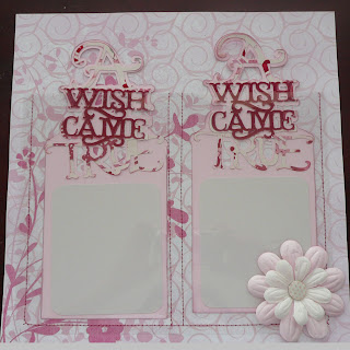
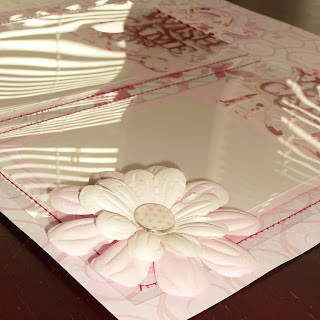
This is the title page. I made two pockets with large tags inside them. The pockets were made out of acetate teachers use for overhead projectors. For the life of me I can't think what that is called. It was sewn onto the pattern paper on three sides and down the middle. I then created the tags in my Gypsy using TBBM, StoryBook and GBS. There is one tag for mom and one for dad so that they can journal wishes for their new baby or blessings.


As you can see, the title page has two pages. One is the layout design and page 2 is the page that has the actual cuts. One of the items that didn't make it to the cut mat was the rectangle I used from GBS that served as a placement for the acetate pocket. I had it there so that I could design the tags the right size.

For the first template, I used a 5x7 picture on the left and two 4x6 on the right. I have 4 pages done with this basic template...well I will when I am done. I am currently working on the second page of this template. The frog prince is the theme of this one.
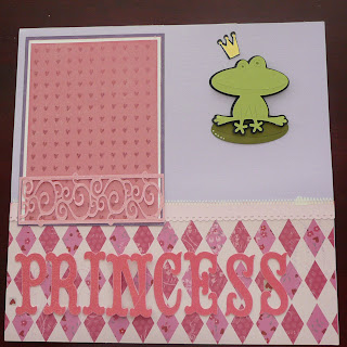
I didn't one to leave the photo placements a bare white spot so I used small patterned paper as place holders, then framed them twice.
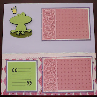
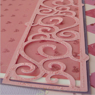
I added small decorative frames to the bottom. They are only glued down on three sides so that the picture will be able to slide onto the frame. I also put a little journal spot on the page for mommy to write.
Here is a picture of my Gypsy file. I used a 12X24 inch mat to do my design my double page layout. Each page has a different theme, frog, butterfly, crown, etc. But the last page of my file is the page that I actually do all my cutting and I only place things on the left side of the mat (the first 12 inches). When you do this, you can use a 12X12 to cut your design, even if you used 12X24 mat to design.

 Some people like to cut out everything, for the whole album, before they start working on a page. I found that I prefer to work on one double page layout at a time. Designing probably took the longest. I had to create templates that met the criteria of photo sizes, come up with themes for each page, create new designs, etc. Now, all I am doing is cutting, grabbing the coordinating paper then gluing, stamping embossing. Over the next few days I will be adding pictures of the pages as I complete them. My plan is to do a double layout per day. Hopefully I can be done in the next two weeks so that I can give my friend her gift.

WOW!!! How beautiful this is, she is going to LOVE this gift! It is perfect in every way. Can I be your friend and then you could send me GORGEOUS gifts like this?
ReplyDeleteI agree, this is beautifully planned out and all the attention in the pre-production phase is going to pay off tremendously in the end....I love it...so very pretty! :)
ReplyDeleteThanks guyy!
ReplyDeleteI left you a little something on my blog!
ReplyDeleteAbsolutely gorgeous. I would just love it if you willing to share the file so that I can make one for my friend.
ReplyDeletePam I would love to but I don't know how to share files yet. LOL
ReplyDelete